Camellias for Jessica 2016
DELIGHT
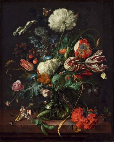
My mother introduced me to glory of dutch flower paintings and together we visited exhibitions in Amsterdam and at The National Gallery.
Looking at them again now reminds me of the delight we felt wandering around the galleries, much like the pleasure to be found within the Dutch ‘Wunderkammers’, full of wonders of the natural world from exotic countries across the globe, found through the reach of the East India Company.
I am amazed at the skill of these artists working hundreds of years ago, who created paintings which are incredibly representational and yet sublime too. The Dutch had a word for it - 'bedriegertje' which means 'little deception'.
PLANNING
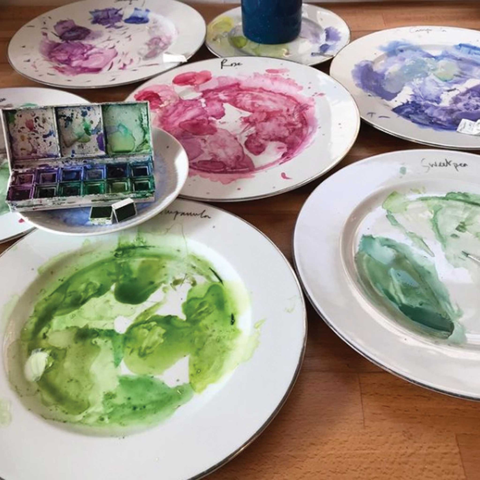
I had already decided to paint a series of 4, one for each British season and had been gathering tantalising lists and sketches of flowers, weeds, insects for each category (Winter, Spring, Summer, Autumn).
I have just come across the series by Peter Casteels of a vase for each month and I LOVE them.
The thematic planning plus the fairly rigid construction behind the apparently wild and naturalistic arrangement of the Dutch flower paintings really appeals to me.

August by Peter Casteels 1730
STRUCTURE
As when filling vases full of flowers in real life, the Dutch painters seem to favour certain rules when composing their their flower arrangements.
Naturalistic decay
There is a lot of wild abandon in the arrangements including naturalistic touches like wilting or collapsed blooms. This is a clever devise for extending the arrangement to the bottom of the composition and also is the reflection on the decay of natural things. They are Memento Mori.
Rather as with Andy Galsworthy (whose work I love too), the dutch flower paintings are beautiful representations of the natural world’s cycles of formation, collapse and reform, which is impervious to the purchasing power of human desire, except for at a remove when buying paintings and photos.
For the aspirational Dutch middle classes, the paintings were more affordable than the hugely expensive flowers themselves, and of course a permanent status symbol.
So really these paintings encapsulate the human preoccupation of our existence as physical creatures of organic matter, with endings and beginnings. And as with Dutch flower paintings, it is through images and photographs of ourselves by we achieve some measure of immortality. But more fundamentally, in the memories and imaginations of others.

Bouquet of Flowers in an Urn by Jan Van Hysum 1774
Symmetry & Swaying Ss
Many of the earlier Dutch Flower paintings of the 1600s are composed of a mannered and pleasing Symmetry, which echoes the benign trammelling by human hand of nature into a display of perfection. Another commonality in the composition is the use of a loose S shape which gives a dynamism and flowing liveliness.
Vase of Flowers by Jan Davidsz de Heem c 1660.
DEVOTIONAL
In the 1600 and 1700s, the wealthy Dutch bourgeoisie had replaced the catholic church as the patrons of the arts. The apparently secular flower paintings do have a transcendent quality and inspire praise of creation itself, which then was still firmly attributed to (a protestant & puritan) God. They are more flamboyant than their Lutheran patrons would perhaps countenance in other decorations. Perhaps they be read as an expression of suppressed passion and the natural exuberance of Humankind.
Some of the paintings have a renaissance like flatness, regularly-spaced, forward-facing composition, which I recognise as a style I lean towards in my painting. They feel very like altarpieces to the universal religion of worshipping nature. In these times of global pandemic and societal worry, ‘Nature Cure’ has become so important, and still now the Dutch Flower paintings have devotional value.
There are some over religious elements, seen in the frequent choice of the white lily and red carnations for the Virgin Mary and with the backdrop of the stone arched niche which suggests the insides of church. I love the curved frame of these backdrops.

Narcissus and other Flowers in a Roemer in a Niche, by Balthasar van der Ast c 1610
EXOTICA
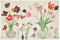
Tulips
These extraordinary flowers feature in most of the Dutch flower paintings, and are often as the main attraction of the arrangement. Tulip Fever is the most fascinating story of how the exotic, poisonous bulbs were first found in Turkey and bought back to the Dutch court, yielding flowers of almost inconceivable beauty, and foreignness. Tulip bulbs became more expensive than gold.
Hyacinths
These sweet smelling, generous flowers were also exotic imports from traders, bought back from east Asia. By the early 18th century, hyacinths had surpassed tulips in popularity and were available in a range of new colours, including purple, red, white, and pink. By the end of the century, over two thousand varieties of hyacinths were grown in the Netherlands.
There is so much exciting literature about this period, and I recommend this brilliant book about John Tredescant, an English naturalist, gardener, collector and traveller.

https://www.philippagregory.com/books/earthly-joys
INSECTS
Oh, this tiny beautiful characters! I am having such trouble painting them in a way that does not end up like a cartoon. The inclusion of butterflies, bees, dragon flies, spiders, snails, ladybirds et al is a reflection of the curiosity at the time of the wonders of natural world.
Some were understood to be symbolic, for example the butterfly was understood as “a symbol of the resurrection of the body after the Last Judgement, its transformation from earth-bound caterpillar to air-borne beauty a metaphor for a soul freed of earthly encumbrances and ascending to Heaven” (National Gallery Exhibition Catalogue 2016)
Birds Nests too appear frequently in the later paintings and are wonderful reminders of hope and rebirth.
BACKGROUND
The deep monotonous darkness of the background for many of the dutch paintings, particularly the earlier paintings, successfully achieves the chiaroscuro affect, but I don’t really like it. I find it too dead and heavy and I don’t know how I would create it so solidly in watercolour.

Hollyhocks and Other Flowers in a Vase, Jan van Huysum, 1702-20.
The later Dutch flower paintings introduce lighter backgrounds with hints of landscaped scenes, architectural features or just plain lighter colours.

Flowers in a Vase, Paulus Theodorus van Bruseel, 1789
VASES
“The inclusion of Chinese porcelain objects in paintings not only signified wealth and refined taste, but was a reminder of the global trade in which the Netherlands was engaged during the 17th and 18th centuries.” (National Gallery Exhibition Catalogue 2016)
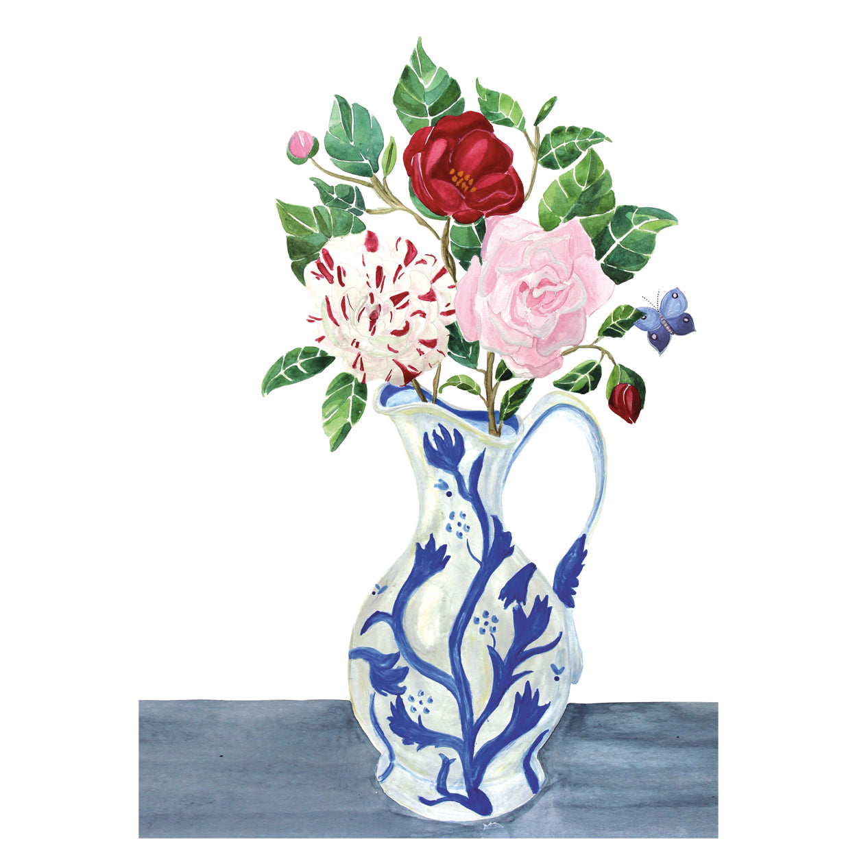
The Dutch Flower Paintings display vessels which are mostly blue and white China-From-China or Delftware (which I don’t madly like), or terracotta vases moulded to show classical imagery, or beautifully reflective glass. I don’t have any terracotta and my painting skill does not reach to glass.
I follow contemporary artists such as Debbie George, of whose work I am very fond, and others in her genre which might be called Modern Impressionist Neo-Midcentury (perhaps New Century? Is it too early to name an art movement such?) – or something less pompous.
One of the features which is so charming of her work is the use of one of her large collection of china – mugs, jugs etc – which she will paint as vases for informal posies. These paintings have the opposite character from the dutch flower paintings- they are un-ostentatious, and not interested in grandeur, but they share the celebration of the daily pleasure which flowers in our homes give us, whether on a table or on the walls.

Debbie George
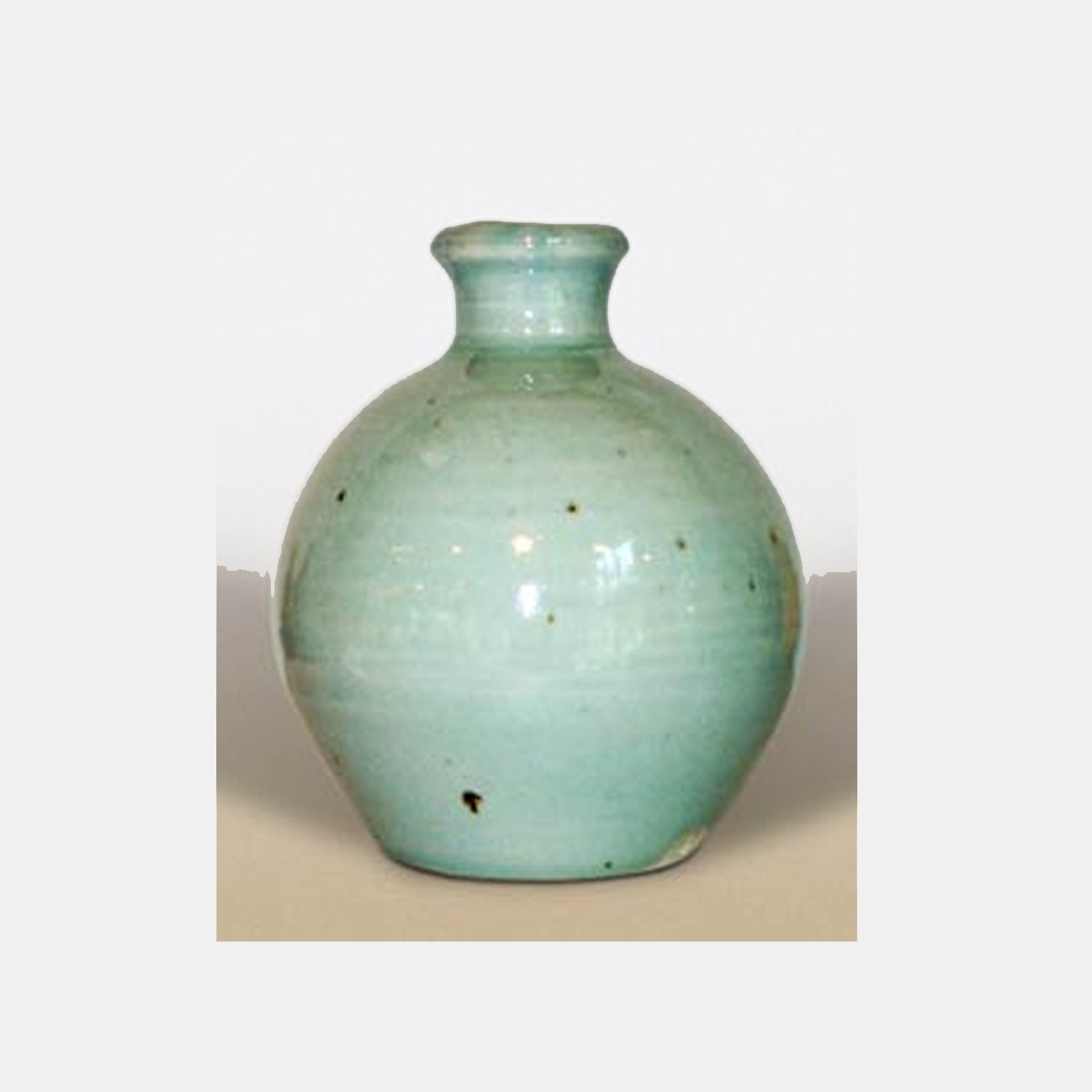
I have a much loved collection of vases, bought, given and inherited. They all have a history which is important to me.
There is a Trevor Corser (Leach Pottery) Green Vase which was on of the first pieces of art I bought for myself at 16. It is the perfect green and a sublime pregnant shape. The lip was broken by one of the children years ago, and while I was (quietly) upset at the time, I now see the break as part of this vase’s story and charm.
I have the white vase with raised blue decorations, which we always used to put daffodils in at Lambessow, and a Sue Binns white tall jug with blue stripes which has become iconic in the years since it was a kind wedding present (15 since you ask). And a commemorative wide double handled jug for The Duke of Wellington Regiment 1795 – 1895. And an eccentric collection of 1930's white vases which remind me both of decorating daddy’s chapel for him with wayside lilies and his favourite chrysanthemums, and also Constance Spry.

Camellias for Jessica 2017
Ultimately, of course, nothing is as a beautiful as flowers themselves and we petty men . . .
Inspiring Descendants of The Dutch Flower Painters

William Nicholson

Samuel Peploe

Marianne North
Elizabeth Blackadder

Nick Knight
Comments will be approved before showing up.